Why the tower
Where we started
Castle Gambit’s first mark was a rook on a yellow card. It did its job for launch: it read as chess at a glance, it was warm, and it matched the paper-and-ballpoint look of the app. But it had three problems that grew the more places we needed it.
- It was the default. A rook is the first icon anyone reaches for to say “chess”: apps, sets, clubs and tournaments use one. A mark that looks like everyone’s is hard to remember and harder to own.
- It was about the piece. Castle Gambit is about the room: a real club, in a real town, on a Tuesday night. A rook says nothing about that.
- It only worked in full colour. It needed a yellow tile, a white body, a blue outline and a separate underline: four parts in three colours. Without the colour it was a plain rook outline, and at browser-tab size the underline and outline blurred together.
What the tower means
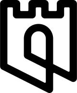
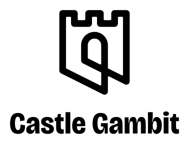
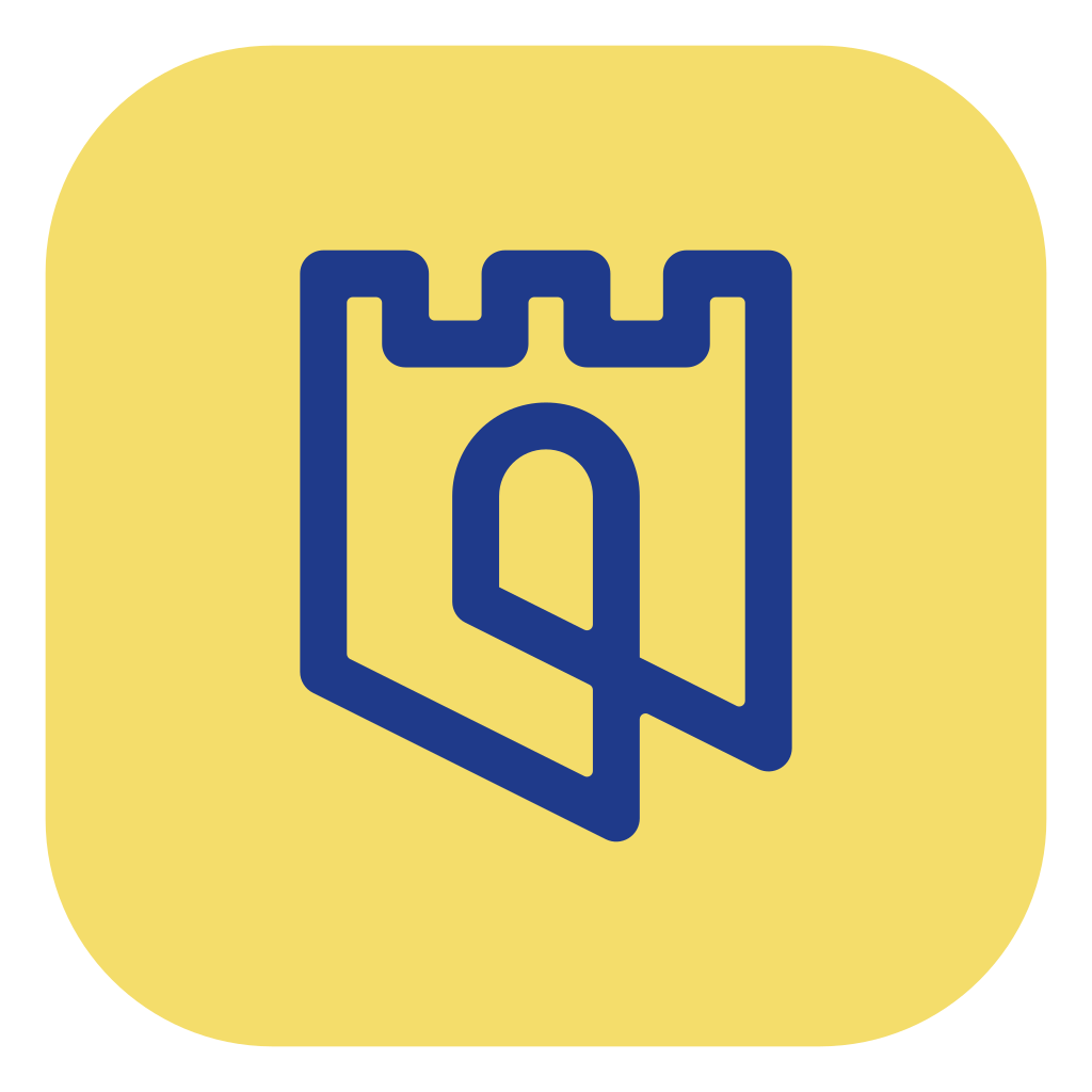
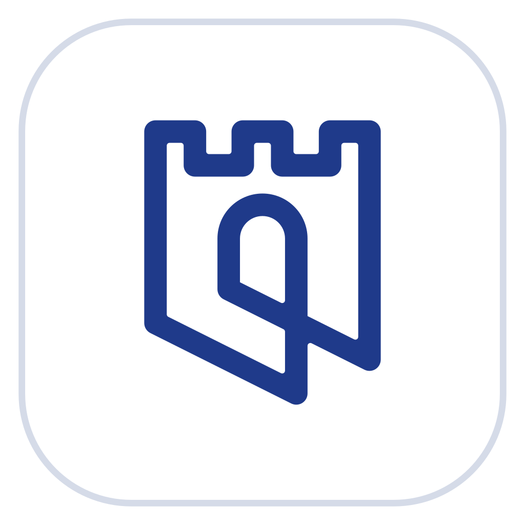
On Castle Gambit a club is called a Castle. So the mark is a castle, and every part of it says something about clubs.
- Three battlements make it a castle at any size, the one shape everyone knows.
- The arched door is the way in. A club is somewhere you walk into, and the door is open: you belong there the first night you turn up.
- The leaning base runs at exactly the slope of a knight’s move, one across and two along, so the tower looks like it’s stepping across the board. That’s the gambit: a move, and an open offer anyone can accept.
- One continuous line draws the whole thing, the way a ballpoint never leaves the scoresheet: the club night’s paperwork, turned into a mark.
A castle with a door, stepping like a knight, drawn without lifting the pen.
How we made it better
The first drawing of the tower had the idea, but its file was a traced picture: hundreds of curve points, a line that thickened and thinned, wobbly edges and three overlapping shapes. We rebuilt it as real geometry and kept its character.
- One line weight everywhere, so nothing looks heavier than anything else.
- A true half-circle arch over the door, where the traced one was lopsided.
- Both diagonals parallel and at exactly 1 : 2, the knight’s move, where the traced ones drifted.
- A few dozen points instead of hundreds, one shape instead of three, and a tenth of the file size. It stays crisp from a browser tab to the side of a building.
Why it goes further
A mark earns its keep in the places nobody designs for: the browser tab, the cap, the photocopied flyer, a club’s own website. The tower was built for all of them.
- Any size. It holds from the 16 px browser tab (where we draw the line a touch heavier) to the app icon to a sign over the door.
- Any single colour. It’s one shape, so it prints in one ink, foils, embosses, stamps and engraves exactly as it looks on screen. The rook needed three colours to be itself.
- A family of colours. Ballpoint for the app, canary for warmth, carbon for dark backgrounds, paper for print, all from the same drawing.
- Thread. One continuous line stitches as one satin column in a single pass, with one crossing. Caps, shirts and patches come out clean.
- Motion. The line closes on itself, so a pen can trace it without a seam: the tower can load, and arrive, as itself.
Side by side
| The rook | The tower | |
|---|---|---|
| What it says | Chess, like every chess brand | A club: a castle with an open door, making a move |
| Parts | Tile, fill, outline and underline | One line |
| Colours to print | Three | One |
| In one colour | A plain rook outline | Exactly itself |
| At browser-tab size | Outline and underline blur together | Battlements and door still read |
| Embroidery | A fill and an outline: two threads | One satin column, one pass |
| Motion | Can only move as a whole | Traces as one closed line |
What stayed
We changed the mark, not the brand. The ballpoint blue, the canary highlighter, the cool paper and the carbon dark stay. So does the wordmark, set in Bricolage Grotesque ExtraBold, condensed. And the yellow rook isn’t retired: it lives on as the coach in the opening trainer, a character now rather than a logo.